theme

Standard with Sections Support
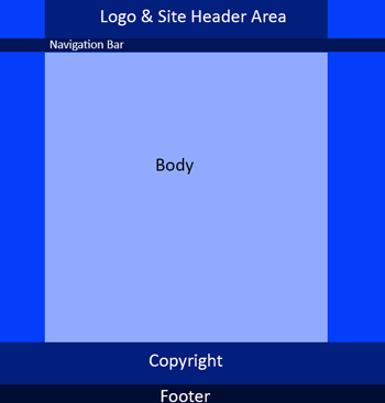
The Best Way Business Standard with Sections Support Theme provides a generous space at the top of the site (header area) for branding. It is fully responsive to all screen widths. It will look great on any device.
It provides a 200px tall main header image area for branding and loads an alternate 50px tall header that remains on top (along with navigation) when a user scrolls down.
- This theme also supports Sections, unlike the basic, standard theme #1, which is the same in every other aspect.
For narrower screen widths (pads and mobiles) it automatically loads the mobile header (slide out menu, logo & action icons).
This theme requires 4 or 5 site-wide images. You will need to use our CMS to either create these images or upload your custom images for the following:
- Background (Optional)
- Full Size Header
- Short Header
- Mobile Logo
- Social / Favicons
CUSTOMIZATIONS: Easily change theme images, colors, backgrounds and more ...


 Follow

