theme

One Screen
The One Screen Theme is fully responsive to all screen widths. It will look great on any device. It provides "tabs" for navigation at the top of the website, but instead of the tabs opening to new pages, they scroll down page to the tab section. Each section is customizable.
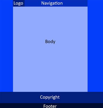
The design facilitates the use of a small header that remains on top and left of the navigation bar. Your logo and navigation will stay on top as users scroll down the page. Keep the size of your logo between 150px X 50px and 225px X 60px.
This theme is not intended for use with large content websites, but for basic informational sites. The main advantage is the end-user experience offered is that they can get to all content by simply scrolling down the page. If they use one of the navigational tabs (which always stay on top), their view will scroll down the page to the tabbed resource.
For narrower screen widths (pads and mobiles) it automatically loads the mobile header (slide out menu, logo & action icons).
This theme requires 3 to 4 site-wide images. You will need to use our CMS to either create these images or upload your custom images for the following:
- Background (optional)_
- Logo
- Mobile Logo
- Social / Favicons
Each tab has its own content area that you may style as you like:
- Background image & size
- Background color
- Font color
- Custom CSS styling
NOT Supported with this Theme:
- Left or Right Widgets
- Breadcrumbs
- Sub-navigation
CUSTOMIZATIONS: Easily change theme images, colors, backgrounds and more ...


 Follow

