theme

Advance
The Advance Theme is popular with those that don't want to take a lot of space for their branding (logo & header image at top of website) and ALSO want heading, text and image transitions with parallax.
Parallax functions are added by utilizing Section Start & Section Close from the CMS Toolbox.The container of the website will be full width or 100%. It is fully responsive to all screen widths. It will look great on any device.
You cannot use the left or right side widgets with this theme.
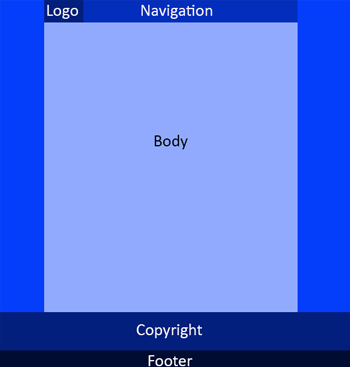
The design facilitates the use of a small header that remains on top and left of the navigation bar. Your logo and navigation will stay on top as users scroll down the page. Keep the size of your logo between 150px X 50px and 225px X 60px or your navigation bar will be forced to wrap to a line below.
For narrower screen widths (pads and mobiles) it automatically loads the mobile header (slide out menu, logo & action icons).
This theme requires 3 to 4 site-wide images. You will need to use our CMS to either create these images or upload your custom images for the following:
- Background (optional)
- Logo
- Mobile Logo
- Social / Favicons
CUSTOMIZATIONS: Easily change theme images, colors, backgrounds and more ...


 Follow

